12.1 Why maps
How might maps be useful for political scientists? What are examples of questions maps can help answer?
“The visualization of spatial data through maps enables researchers to discover previously unknown patterns and present their findings in a convincing manner.” - Kosuke Imai, Chap 5 QSS
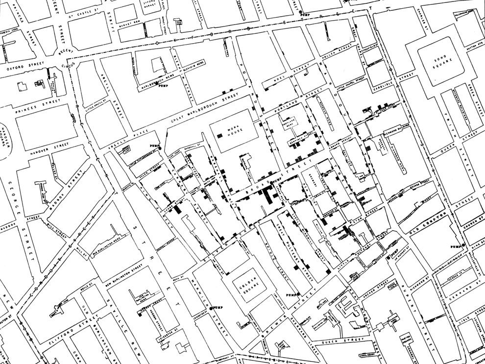
National Geographic. Mapping fatal cholera cases helped John Snow uncover the source of a cholera outbreak in London to an infected water pump in 1854.
Why are maps used in political science
- Show diffusion of a disease, policies, political power
- Show demographic patterns
- Examine clustering, regional patterns of different policies, events, etc.
- Shift analysis away from an individual person or political unit to instead think about the broader social and political context
- Convey a lot of information efficiently, and in an engaging way, using intuitive heuristics of commonly known geographic locations
Most maps are also inherently political! (e.g., historical trends in political boundaries, which geographic entities are recognized, etc.)
Maps themselves may be the subject of interest. For example, we are currently in redistricting to determine the boundaries used for different elections in the U.S.
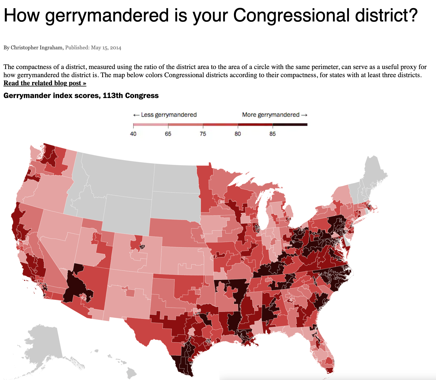
Washington Post
12.1.1 To map or not to map?
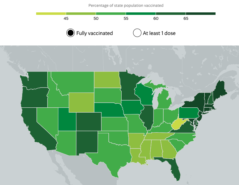
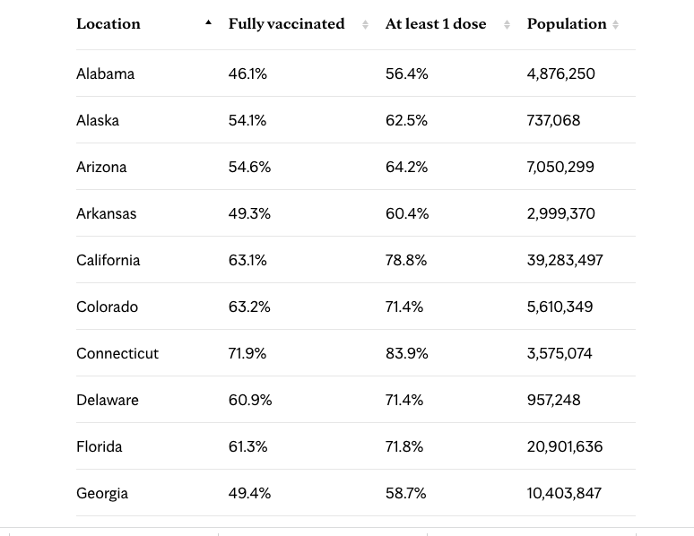
If I wanted to track COVID vaccinations by state, what are the pros and cons of using a table vs. a map? See this example from the Mayo Clinic.
Can maps be misleading? See this discussion from Kieran Healy in Chap. 7: Each of these maps shows data for the same event, but the impressions they convey are very different … Often, a map is like a weird grid that you are forced to conform to even though you know it systematically misrepresents what you want to show.”
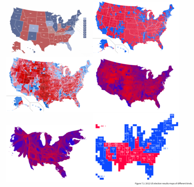
Healy Chapter 7