13.2 Where to Go Next
Recall that we said, four primary goals of social science include:
- Describe and measure
- Has the U.S. population increased?
- Explain, evaluate, and recommend (study of causation)
- Does expanding Medicaid improve health outcomes?
- Predict
- Who will win the next election?
- Discover
- How do policies diffuse across states?
In this course, we have explored a taste of each of these goals, while learning a bit of R code and statistics along the way.
- We described trends in voter turnout, tolerance for domestic violence in different parts of the world
- We estimated the causal effect of experiments to test for discrimination in the labor market, the effect of social status messages on attitudes toward economic policy, and the implementation of wind turbines on electoral support
- We predicted the outcomes of future elections, whether someone is a campaign donor, and questioned the fairness of using these types of “machine learning” models in real-world settings, such as on social media platforms or in the criminal justice system
- We discovered patterns in political speeches, such as the State of the Union and country constitutions, and we visualized geographic diffusion of policies and international terrorist incidents.
This section will provide a few ideas of ways you can continue your learning about data science and its use within social science.
13.2.1 Network Analysis
One topic we do not cover in great depth is the use of network analysis in social science.
Networks can be a really interesting topic to study in political science and other social sciences because they are inherently “social.”
- Networks describe the relationships between people, countries, institutions, etc. instead of evaluating each in isolation.
- Similar to our section on mapping, with networks, we often visualize the interconnectedness using graphics
Network analysis may be particularly useful in an area like international relations where scholars try to identify relationships between states.
- For example, some scholars map international trade networks.
- This paper by Dotan Haim (2016) explores how the nature of shared political alliances influences the amount of trade.
We are going to look at an example of a network of Twitter following among U.S. Senators, following the application of network analysis in QSS 5.2.
In R, we can use the igraph package to visualize networks.
install.packages("igraph")To use the package, we open it with library().
library(igraph)We can look at a network of which U.S. senators follow each other on Twitter, based on data from QSS chapter 5. Let’s open the network data.
twitter <- read.csv("https://raw.githubusercontent.com/ktmccabe/teachingdata/main/twitter-following.csv")
head(twitter)
## following followed
## 1 SenAlexander RoyBlunt
## 2 SenAlexander SenatorBurr
## 3 SenAlexander JohnBoozman
## 4 SenAlexander SenJohnBarrasso
## 5 SenAlexander SenBennetCO
## 6 SenAlexander SenDanCoatsNote that the data include two columns:
following: Twitter screen name of the senator that is following the senator in the second columnfollowed: Twitter screen name of the senator that is being followed by the senator in the first column
Twitter represents a “directed” network. This means that a “tie” between two individuals has a direction. Take, for, instance, the difference between Facebook friendship and Twitter following.
- On Facebook, when you become friends with another user, you both are considered friends with each other. There is no directionality to the relationship in that space. This is “undirected.”
- In contrast, on Twitter, you can follow someone with/without that person following you. This is “directionality” meaning that we have to indicate specifically in which direction/both directions the connection exists between users.
We are going to create a second dataframe which is called an “adjacency matrix” which indicates the presence or absence and direction of “ties” between each user. QSS pg. 212 describes how you can convert the simple list of follows we had into this type of matrix, and we will follow a slightly different process using the function graph_from_data_frame. We load a dataframe that contains information about each senator where the first column includes the screen names, just like the other dataframe.
senator <- read.csv("https://raw.githubusercontent.com/ktmccabe/teachingdata/main/twitter-senator.csv")twitteradj <- graph_from_data_frame(d=twitter, vertices=senator, directed=T)
twitteradj[1:6, 1:6]## 6 x 6 sparse Matrix of class "dgCMatrix"
## Lamar Alexander Roy Blunt Barbara Boxer Sherrod Brown
## Lamar Alexander . 1 . .
## Roy Blunt 1 . . .
## Barbara Boxer . . . 1
## Sherrod Brown . . 1 .
## Richard Burr . 1 . .
## Tammy Baldwin 1 1 1 1
## Richard Burr Tammy Baldwin
## Lamar Alexander 1 .
## Roy Blunt 1 .
## Barbara Boxer . 1
## Sherrod Brown . 1
## Richard Burr . .
## Tammy Baldwin 1 .We are going to visualize the network. To make it more informative, we will color the plot according to the partisanship of senators. Because our senate dataframe is in the same order as the adjacency matrix, we can do the following:
col <- NA
col[senator$party == "R"] <- rgb(1,0,0, alpha=.5)
col[senator$party == "D"] <- rgb(0,0,1, alpha=.5)
col[senator$party == "I"] <- "black"
We can now use the plot function with our matrix.
plot(twitteradj,
     vertex.color = col,
     vertex.label = NA,
     edge.arrow.size = 0.1,
     edge.width = 0.5)
What do you notice about this network visualization?
- What is easy to see from this? What is hard to see from this? What other information would you like to know?
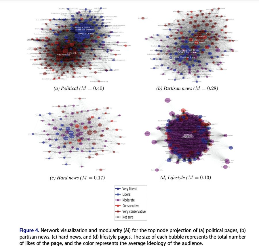
Polarization is pretty rampant in American Politics. Recently, a set of political scientists used network analysis to explore just how far polarization pervades into our lives, even when we are engaging in tasks and hobbies unrelated to politics. Stiene Praet and co-authors assess whether the Facebook likes of individuals in political vs. non-political lifestyle domains appear polarized. Fortunately, they do not find severe polarization in less political arenas. You may think you know everything about someone based on their food, exercise, and tv habits, but we are not fully polarized in those domains … yet.
While these visuals gives us a little information, there is far more you can do with networks to better quantify the shape of the network and information about which units are most connected and most central to a network.
- Explore QSS Chapter 5.2 to learn more about betweenness, centrality, closeness and degree
- The data described in the chapter can be downloaded here
- For more on network visualization and analysis, you can also explore Professor Katherine Ognyanova’s website (School of Communication and Information), which has multiple tutorials about network analysis in R that you can download here
13.2.2 Additional Topics to Explore
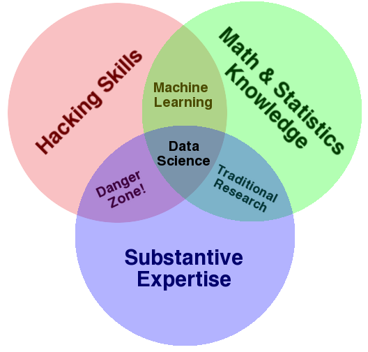
Recall that in the beginning of the semester we looked at the venn diagram of data science from Drew Conway. Throughout the semester, we have answered substantive research questions in political science using data science approaches. We have developed our R skills, and used a little bit of math and statistics. As you go forward, you may want to add additional skills and training.
Self-Study Options
To gain additional math and statistics skills to support what you have done so far, you can review Chapter 6 of QSS for self-study. It focuses on probability. We already covered some aspects of Chapter 7 of QSS on uncertainty, but you could also review these sections as well to gain more experience with the underlying mathematical calculations that go into calculating standard errors and constructing confidence intervals.
If you want to continue to practice R outside of QSS, here are two online books to consider:
For more examples of research at the intersection of data science and social science, you can continue also to read from Bit by Bit by Matt Salganik. We read excerpts of this in the course.
Course Options
If you would like to continue studying quantitative social science, you might also consider taking courses that count toward the following programs.
- Certificate in Quantitative Political Science Methods
- These include undergraduate courses in statistics, political science research methods, and other methods classes in the social sciences
- These also could include doctoral level classes in political science focused on quantitative methods, experiments, game theory, and measurement
- Data Science Certificate/Minor
- In these classes, you may expand your data wrangling, collection, and programming skills and apply them to a wide range of domains.
In addition, one way to practice your skills is to complete an undergraduate thesis during your senior year.
13.2.3 That’s all