4.5 Scatterplots
It turns out that study was completely fabricated, and the article was eventually retracted.
How did people know? Well a team of researchers became suspicious based on exploratory analyses they conducted with the data. Let’s do a few of these to learn about scatterplots and histograms.
Scatter plots show the relationship between two numeric variables.
A common way to describe and quantify a relationship is through correlation.
- Correlation: When \(x\) changes, \(y\) also changes by a fixed proportion
- Asks: If you are a certain degree above the mean of \(x\), are you similarly that much above the mean of \(y\)?
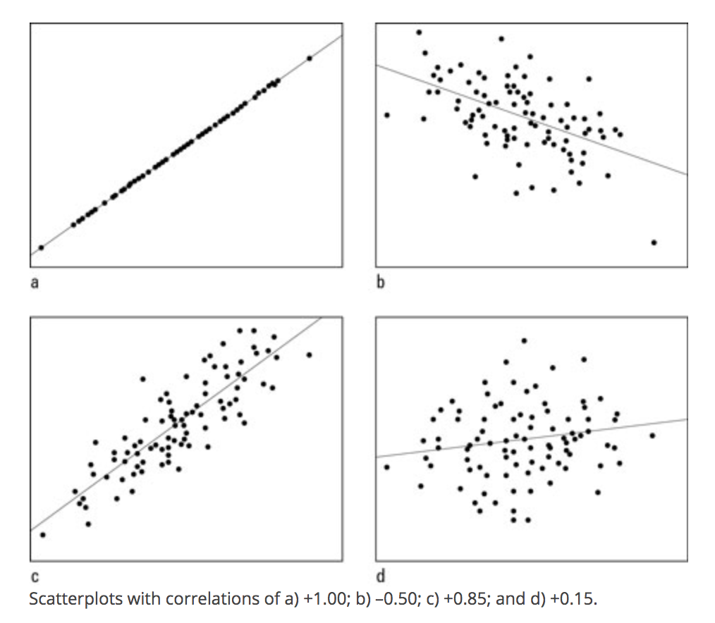
- Positive correlation: data cloud slopes up;
- Negative correlation: data cloud slopes down;
- High positive or negative correlation: data cluster tightly around a sloped line
- Not affected by changes of scale: cm vs. inch, etc.
Range of Correlation is between \(-1\) and \(1\)
- Look at the graphs below for examples of high and low positive and negative correlations.
R for Dummies
The plot() function in R works using x and y coordinates.
- We have to tell R precisely at which x- and y- coordinates to place points (e.g., place a point at
x=20andy=40) - In practice, we will generally supply R with a vector of x-coordindates and a vector of corresponding y-coordinates.
To illustrate a scatterplot, we will examine the relationship between the Wave 1 and Wave 2 feeling thermometer scores in the field experiment, for just the control “No Contact” condition.
## Subset data to look at control only
controlonly <- subset(marriage1, treatment == "No Contact")
In the plot(), we supply the x and y vectors.
xlimandylimspecify the range of the x and y axis.pchis the point type. You can play around with that number to view different plot types
plot(x=controlonly$therm1, y=controlonly$therm2,
     main = "Relationship between W1 and  W2",
     xlab = "Wave 1", xlim = c(0, 100),
     ylab = "Wave 2", ylim = c(0, 100),
     pch = 20)
The correlation looks extremely high! It is positively sloped and tightly clustered.
In fact, if we use R’s function to quantify a correlation between two variables, we will see it is a correlation above .99, very close to the maximum value.
- By default, R calculate the “pearson” correlation coefficient, a number that will be between -1 and 1. It represents the strength of the linear association between two variables.
## use = "pairwise" means to use all observations where neither variable has missing NA data
cor(marriage1$therm1, marriage1$therm2, use = "pairwise")
## [1] 0.995313This high correlation was unusual for this type of data.
- Feeling thermometers suffer from low reliability. How a person answers the question at one point in time (perhaps 83) in Wave 1 often differs from the numbers they say when asked again at a future point in time in Wave 2. A person’s responses often aren’t that stable.
- Because there was such a high correlation, it suggested that the data might not have been generated by real human responses