4.10 Visual tips and tricks
Recall we said the goals of visualization are to communicate information
- Transparently (show me the data!)
- Quickly
- Simply
- Accurately
- And with a little work: beautifully
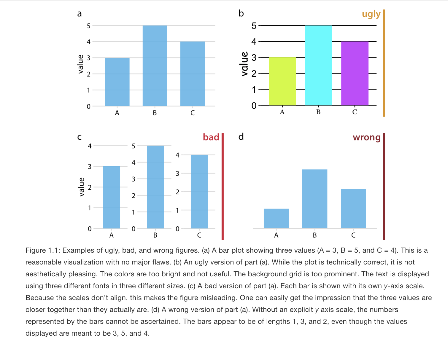
What NOT to communicate?

Claus Wilke provides an overview of rules of thumb to fall when creating a data visualization on the Serial Mentor website.
An example is below
Overall, the best thing to do is to look at your visual from a consumer’s point of view. You want your visuals to be intuitive enough for a viewer to be able to interpret it without too much help from you or explanatory text elsewhere in a paper or presentation. Our goal is to help consumers of our data understand the main takeaways of our research easily and accurately.
- We want to make sure our visuals always have informative labels that a lay person can understand (instead of technical variable names, we can use plain language)
- We may need to add a legend or additional text to a visual to help with this
- We want to choose colors to convey information. We want to avoid colors that are hard to see or might distract consumers.
- The axis dimensions should not be misleading. If the goal is to compare two or more plots to each other, we would want them to have similar axes, for example.