12.9 Application: Spread of Coronavirus
Mapping isn’t the only application where we might want to show an animation. Here is a brief example using ggplot in a different way to reveal trends over time.
We are going to map the spread of confirmed COVID cases based on data from John Hopkins University.
load("covidlongfmt.RData")We have variables case_count and Country.Region along with date_fmt. Let’s compare trends in confirmed cases between Italy and France.
italyspain <- subset(covidlongfmt, Country.Region %in% c("Italy", "Spain"))Let’s divide cases by 1000 to make it easier to visualize.
italyspain$case_count_thousands <- italyspain$case_count /1000With ggplot, this time instead of using geom_polygon, we will use geom_line. Our x-axis will be time, and our y-axis will be the case count.
Again, to animate a ggplot, we just add an argument to indicate the variable that dictates the transition between different states, in this case, the date variable, date_fmt. The other parts of the plot stay very similar to before.
ggplot()+
  geom_line(data=italyspain, aes(x=date_fmt, y=case_count_thousands,
                                 colour=Country.Region))+

  ## Add labels with exact case count
  geom_text_repel(data=italyspain, aes(x=date_fmt,
                                       y=case_count_thousands,
                                       colour=Country.Region,
                                 label=case_count_thousands))+

  ## axis and title labels
  ylab("Cases (thousands)")+
  ggtitle("Confirmed Cases in Italy and Spain")+
  theme_minimal()+

  ## We use transition_reveal to slowly reveal the trend
  transition_reveal(date_fmt)+
  labs(x = "Date: {frame_along}")
anim_save("italyspain.gif")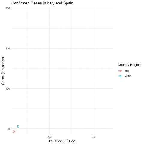
12.9.1 Mapping Animation with World Map
Just like with the terrorism data, we can make a map with the data, too.
To illustrate the process, let’s create a plot for just one day: 2020-03-01.
covidmarch <- subset(covidlongfmt, date_fmt == "2020-03-01")We create a world map and add points to indicate the case count, with the size proportionate to the count. We include alpha to make the points transparent.
world <- map_data("world")

ggplot()+

  ## create the world map
  geom_polygon(data=world, aes(x=long, y=lat, group=group), colour="black", fill="white")+

  ## add points
  geom_point(data=covidmarch, aes(x=Long, y=Lat, size=case_count), alpha=.4, colour="red")+
  scale_size(range = c(-1,10)) +

  ## aesthetics
  ggtitle("COVID-19 Confirmed Cases on March 1, 2020")+
  coord_quickmap()+
  theme_void()
## Warning: Removed 2 rows containing missing values (geom_point).
Now, we use the full data and transition through the date variable. We then “render” and save the animation.
world <- map_data("world")

ggplot()+

  ## create the world map
  geom_polygon(data=world, aes(x=long, y=lat, group=group), colour="black", fill="white")+

  ## add points
  geom_point(data=covidlongfmt, aes(x=Long, y=Lat, size=case_count), alpha=.4, colour="red")+
  scale_size(range = c(-1,15)) +

  ## aesthetics
  ggtitle("COVID-19 Confirmed Cases")+
  coord_quickmap()+
  theme_void() +

  ## add the transition and a label for the plot
  transition_time(date_fmt)+
  labs(title="Date: {frame_time}")
## save animation as a gif
anim_save("covidplot.gif")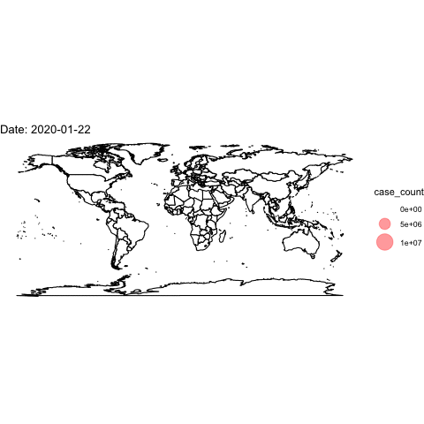
How could we improve this visualization?