12.8 Animating Data
With R, we can go a step further to make our maps more interactive. RStudio and R allow for the ability to turn graphics into interactive applications, as well as animate visualizations to reveal or change the visual over the course of different frames. We will take a brief look at these applications.
Why would we want to do this? An engaging way to reveal changes over time or other states. Adding a bit of drama to presentations.

We will use the package gganimate for this. Install and load the package.
install.packages("gganimate")library(gganimate)To animate a ggplot, we just add an argument to indicate the variable that dictates the transition between different states, in this case, the date variable, iyear. The other parts of the plot stay very similar to before.
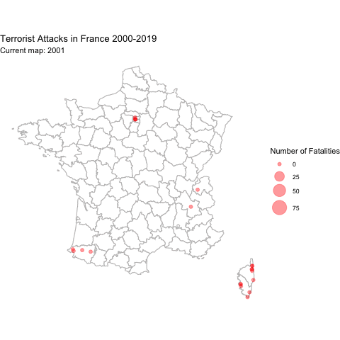
ggplot()+
  geom_polygon(data=france, aes(x=long, y=lat, group=group), fill="white", colour="gray")+

  ## add points with size in proportion to fatalities
  geom_point(data=gtbfrance, aes(x=longitude, y=latitude, size=nkill), alpha=.4, colour="red")+
  scale_size(name="Number of Fatalities", range=c(2, 10))+

  ggtitle("Terrorist Attacks in France 2000-2019")+
  coord_quickmap()+
  theme_void()+

  ## add the transition and a label for the plot
  transition_states(iyear, state_length = 8)+
  labs(subtitle = "Current map: {closest_state}")

anim_save("gtbplot.gif")