• 1 Course Notes
    • 1.1 What have I signed up for?
      • 1.1.1 Data Science Can Help Social Scientists
      • 1.1.2 Course Goals
    • 1.2 Setup in R
    • 1.3 First Time Working in R and RStudio
      • 1.3.1 Open RStudio
      • 1.3.2 Using R as a Calculator
      • 1.3.3 Working in an R Script
      • 1.3.4 Preparing your R script
      • 1.3.5 Executing Commands in your R script
      • 1.3.6 Objects
    • 1.4 Assignment 1
    • 1.5 R Markdown
      • 1.5.1 How to get setup in RMarkdown
      • 1.5.2 Additional RMarkdown resources
    • 1.6 Wait a second why R?
  • 2 Description
    • 2.1 Process of Describing
      • 2.1.1 Example Process
    • 2.2 Summarizing univariate data
    • 2.3 Functions to summarize univariate data
      • 2.3.1 Using functions in R (overview)
    • 2.4 Loading data into R
      • 2.4.1 Working with datasets in R
      • 2.4.2 Measuring the Turnout in the US Elections
      • 2.4.3 Getting to know your data
    • 2.5 Comparing VEP and VAP turnout
      • 2.5.1 Creating new variables in R
    • 2.6 Comparing Presidential vs. Midterm turnout
      • 2.6.1 R shortcut for writing vectors
  • 3 Causation with Experiments
    • 3.1 What separates causation from correlation?
      • 3.1.1 Potential Outcomes Framework
      • 3.1.2 Causal Effects
      • 3.1.3 Fundamental Problem of Causal Inference
    • 3.2 Randomized Controlled Trials
      • 3.2.1 Experiments: Why Randomize?
      • 3.2.2 Experiments: How to Analyze
      • 3.2.3 Ingredients of an Experiment
    • 3.3 Application: Is there racial discrimination in the labor market?
      • 3.3.1 Variable classes
    • 3.4 Making tables
      • 3.4.1 Crosstabulation
    • 3.5 Conditional Means
    • 3.6 Relational Operators in R
    • 3.7 Subsetting data in R
      • 3.7.1 Getting Booooooooolean
    • 3.8 Creating New Variables using Conditional statements
      • 3.8.1 ifelse statements
    • 3.9 Types of Experiments
  • 4 Visualization
    • 4.1 Application: Social Status and Economic Views
    • 4.2 Boxplots
      • 4.2.1 Data Summary: Boxplot
    • 4.3 Barplots
      • 4.3.1 Saving Plots
      • 4.3.2 Creating New Variables
    • 4.4 Application: Changing Minds on Gay Marriage
      • 4.4.1 Creating new variable
      • 4.4.2 Using ifelse to create new variable
      • 4.4.3 Calculating the Average Treatment Effect
      • 4.4.4 Visualize means in a barplot
    • 4.5 Scatterplots
    • 4.6 Histograms
      • 4.6.1 Happy research ending
    • 4.7 Application: Trends during COVID
    • 4.8 Line Plots in R
    • 4.9 Causal claims from before vs. after comparisons
    • 4.10 Visual tips and tricks
    • 4.11 Common R plotting functions and arguments
    • 4.12 A note on ggplot
  • 5 Causality with Non-Experimental Data
    • 5.1 Why can’t we always experiment?
      • 5.1.1 What can we do instead?
    • 5.2 Causal Identification Strategies
      • 5.2.1 Three Common Identification Strategies
      • 5.2.2 Threats to Cross-Section Designs
      • 5.2.3 Threats to Before-After Designs
      • 5.2.4 Threats to Diff-in-Diff Designs
    • 5.3 Application: Economic Effects of Basque Terrorism
      • 5.3.1 Applying 3 Identification Strategies
    • 5.4 Placebo Tests
    • 5.5 Wrapping Up Causality
  • 6 Loops in R
    • 6.1 The anatomy of a loop
      • 6.1.1 The key parts of a loop
      • 6.1.2 A short example
      • 6.1.3 Troubleshooting a loop
      • 6.1.4 Your turn
    • 6.2 Application: U.S. Supreme Court
      • 6.2.1 Troubleshooting the loop
      • 6.2.2 Visualizing the Results
      • 6.2.3 Enhancing the plot
      • 6.2.4 Wrapping Up
  • 7 Prediction
    • 7.1 Prediction Overview
    • 7.2 Process of Prediction
    • 7.3 Example: Forecasting 2020 US Election based on 2016 Results
      • 7.3.1 Choose Approach
      • 7.3.2 Assess Accuracy
      • 7.3.3 Iterate to improve predictions
    • 7.4 Example: Using polls to predict the 2020 election results
      • 7.4.1 Choose an approach: Let’s analyze some polls
      • 7.4.2 Loop through all states
      • 7.4.3 Check Accuracy
  • 8 Prediction with Regression
    • 8.1 Regression in the wild.
    • 8.2 Application: Baseball Predictions
    • 8.3 Step 1: Approach- Regression in R
      • 8.3.1 Visualizing a regression
      • 8.3.2 Making predictions with regression
    • 8.4 Step 2: Checking accuracy of model
      • 8.4.1 Root Mean Squared Error
    • 8.5 Step 3: Iterate and Compare Models
      • 8.5.1 Regression with Multiple Predictors
    • 8.6 Application: Predicting Campaign Donations
      • 8.6.1 Visualizing the results
      • 8.6.2 Step 1: Calculate Predictions
      • 8.6.3 Step 2: Check Accuracy
      • 8.6.4 Step 3: Iterate
      • 8.6.5 Adding Model Predictors
    • 8.7 Uncertainty with Prediction
      • 8.7.1 Example: Butterfly Ballot in Florida
      • 8.7.2 Multiple Predictors
      • 8.7.3 Confidence Intervals
    • 8.8 Cross-Validation
      • 8.8.1 Cross-Validation Process
      • 8.8.2 Application: Forecasting Election Results
  • 9 Fairness and Ethics
    • 9.1 Application: Criminal Justice
      • 9.1.1 Load data
      • 9.1.2 Prediction/Classification process
      • 9.1.3 Step 1: Regression Model
      • 9.1.4 Step 2: Check Accuracy
    • 9.2 Taking Fairness Seriously
      • 9.2.1 Extended Learning
  • 10 Uncertainty
    • 10.1 Hypothesis Testing Overview of Process
    • 10.2 Sampling and Uncertainty
      • 10.2.1 Sampling Distribution
    • 10.3 Z-scores and p-values
      • 10.3.1 Relationship to Confidence Intervals
    • 10.4 Wrapping up the Process
    • 10.5 Application: Health Savings Study
    • 10.6 Additional Applications
      • 10.6.1 Example Using Regression
      • 10.6.2 Example Using prop.test()
    • 10.7 In-Class Exercise Questions
  • 11 Text as Data
    • 11.1 Why text?
    • 11.2 R Packages for text
    • 11.3 Application: State of the Union
      • 11.3.1 Cleaning Text
      • 11.3.2 Preparing a Corpus
      • 11.3.3 Word Frequency
    • 11.4 Word Importance
    • 11.5 Additional Descriptive Statistics
      • 11.5.1 Dictionary Analysis
    • 11.6 Application Programming Interfaces
      • 11.6.1 Twitter API v1
      • 11.6.2 Saving R Objects
    • 11.7 Application: Sentiment Analysis
      • 11.7.1 Searching tweets for keywords
      • 11.7.2 Sentiment Analysis Overview
      • 11.7.3 Implementing sentiment analysis
      • 11.7.4 Your Twitter Analysis
  • 12 Mapping
    • 12.1 Why maps
      • 12.1.1 To map or not to map?
    • 12.2 Mapping in R
      • 12.2.1 Using ggplot2 with maps
    • 12.3 Choropleth Maps
    • 12.4 Application: 2021 NJ Election Results
    • 12.5 Application: Voter Identification Laws
      • 12.5.1 Using the %in% function
    • 12.6 Your turn to map
    • 12.7 Application: Terrorist Attacks in France
      • 12.7.1 Adding points to a map
    • 12.8 Animating Data
    • 12.9 Application: Spread of Coronavirus
      • 12.9.1 Mapping Animation with World Map
    • 12.10 Application: Territorial Control of Syria
  • 13 Choose Your Own Adventure
    • 13.1 How to investigate new data
      • 13.1.1 Dealing with Uninformative Variable Names
      • 13.1.2 Dealing with Missing Data
      • 13.1.3 Dealing with Variable Codings that Aren’t Quite Right
      • 13.1.4 Dealing with Parts of Datasets
    • 13.2 Where to Go Next
      • 13.2.1 Network Analysis
      • 13.2.2 Additional Topics to Explore
      • 13.2.3 That’s all

Data Science for Political Science

4.7 Application: Trends during COVID

For a video companion for sections 4.7-4.9 and the code for line/trend plots, see below. The video only discusses the notes and code. (Via youtube, you can speed up the playback to 1.5 or 2x speed.)

Since the onset of the pandemic in 2020, researchers have evaluated attitudinal and behavioral responses to policy changes, political messages, and COVID case/hospitalization/death rates.

  • Survey data on attitudes and self-reported behavior
  • Health care provider administrative data
  • Mobile phone data to track locations
  • Social media data to track attitudes and mobility

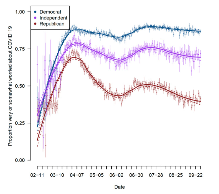
Example: Using Survey data from over 1.1 million responses to measure concern about the coronavirus over time.

  • Clinton, Joshua, et al. “Partisan pandemic: How partisanship and public health concerns affect individuals’ social mobility during COVID-19.” Science advances 7.2 (2021): eabd7204.

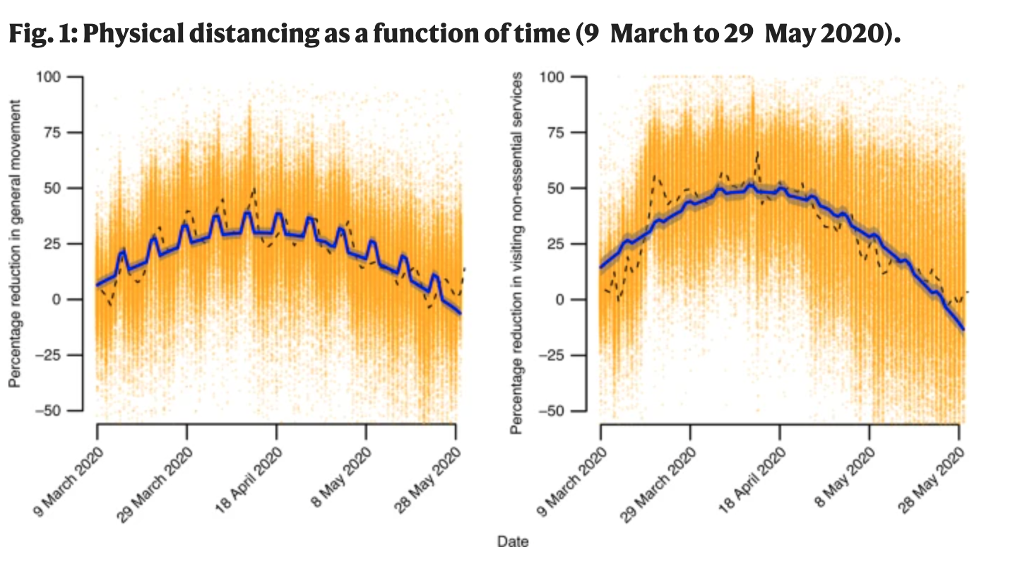
Example: Using the geotracking data of 15 million smartphones per day to compute percentage reduction in general movement and visiting non-essential services relative to before COVID-19 (before March 9).

  • Gollwitzer, Anton, et al. “Partisan differences in physical distancing are linked to health outcomes during the COVID-19 pandemic.” Nature human behaviour 4.11 (2020): 1186-1197.

Example: Using Twitter geolocation data to track how much movement users have by looking at the distances from all locations where a given user has tweeted.

  • Paiheng Xu, Mark Dredze, David A Broniatowski. “The Twitter Social Mobility Index: Measuring Social Distancing Practices from Geolocated Tweets.” Journal of Medical Internet Research (JMIR), 2020.

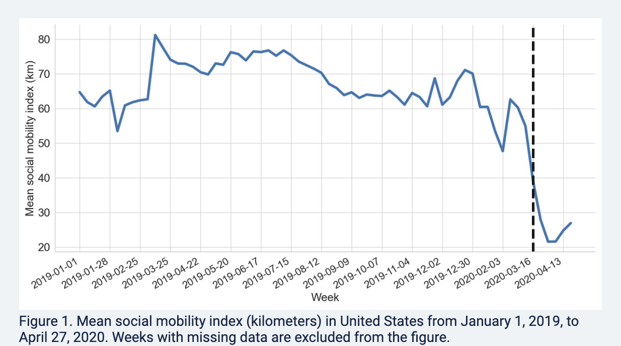
We will use the Twitter social mobility index to study how the movement of geo-located Twitter users changed from 2019 into September 2021.

  • We will compare this movement for users located in the Northeast vs. South

Each row of the dataset represents a week of the year. Each column represents a particular geography for which social mobility was calculated by the researchers.

  • Dates indicates the date
  • Northeast: social mobility data for those in the northeast of the U.S.
  • South: social mobility data for those in the south of the U.S.
## Load the data from the author Mark Dredze's website
covid <- read.csv("https://raw.githubusercontent.com/mdredze/covid19_social_mobility.github.io/master/data/longitudinal_compiled.csv")

Just like we have encountered numeric, factor, and character variables, R also has the ability to treat variables specifically as dates. We will want R to treat the date variable we read in as a date, and not as raw text or some other variable type. To do this, we will use the as.Date function.

## Date variable original format and class
head(covid$Dates)
## [1] "2019-01-01" "2019-01-07" "2019-01-14" "2019-01-21" "2019-01-28"
## [6] "2019-02-04"
class(covid$Dates)
## [1] "character"
## Convert to class Date
covid$Dates <- as.Date(covid$Date)
head(covid$Dates)
## [1] "2019-01-01" "2019-01-07" "2019-01-14" "2019-01-21" "2019-01-28"
## [6] "2019-02-04"
class(covid$Dates)
## [1] "Date"

The researchers continue to add to these data. Let’s look at the portion of data from 2019 to September 2021.

  • Note the use of as.Date again to make sure R knows our text should be treated as a date
  • Note the use of the greater than or equal to >= and less than or equal signs <= to specify which rows we want to keep in the data. We want rows that are in dates after January 1, 2019 and (&) on or before September 1, 2021.
covidsub <- subset(covid, Dates >= as.Date("2019-01-01") &
                     Dates <= as.Date("2021-09-01"))