9.4 Practice Problems for Multinomial
We will try to replicate a portion of the analysis from the paper. Note that different multinomial functions in R and in Stata (which the author used) might rely on slightly different optimization and estimation algorithms, which in smaller samples, might lead to slightly different results. This is one place where your results might not exactly match the authors’, but they should be close.
- Let’s try to replicate Figure 1a in the paper (which corresponds to Table 1a in the appendix), which shows the average marginal effect of being female vs. male on the first future career move, for each outcome category in the data.
- In addition to the
femalecovariate, the author includes covariates forparty_cat(party identification),leg_exp_dumandexec_exp_dum(legislative and executive experience), andleadership(chamber leadership experience) which are each treated as factor variables in the regression. - We should set
party_catto have the baseline ofPRIto match the author.
- In addition to the
ker$party_cat <- relevel(as.factor(ker$party_cat), ref="PRI")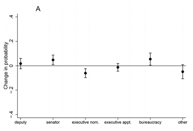
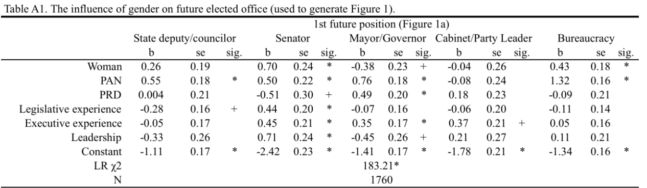
The author sets covariates to observed levels when estimating the marginal effects.
- Based on the marginal effects, how would you evaluate the author’s hypothesis on the effect of gender on future career moves to executive office?
Try on your own and then expand for the solution.
fit2 <- multinom(genderimmedambcat3 ~ factor(female) + party_cat + factor(leg_exp_dum) +
                   factor(exec_exp_dum) + factor(leadership), data=ker)
library(margins)
marg.effect.execnom <- margins(fit2, variables="female", change=c(0, 1), vce= "bootstrap", category="mayor/gov ballot access")
marg.effect.deputy <- margins(fit2, variables="female", change=c(0, 1), vce= "bootstrap", category="deputy/regidor ballot access")
marg.effect.senator <- margins(fit2, variables="female", change=c(0, 1), vce= "bootstrap", category="senate ballot access")
marg.effect.execappt <- margins(fit2, variables="female", change=c(0, 1), vce= "bootstrap", category="cabinet/party leader")
marg.effect.bureau <- margins(fit2, variables="female", change=c(0, 1), vce= "bootstrap", category="bur appt")
marg.effect.other <- margins(fit2, variables="female", change=c(0, 1), vce= "bootstrap", category="other")
Let’s make a visual close to the authors using ggplot. Recall, ggplot is easiest to work with when the data you want to plot are in a data.frame. So we are going to bind together the summary output and specify which row corresponds to which outcome.
mcomb <- data.frame(rbind(summary(marg.effect.execnom),
                          summary(marg.effect.deputy),
                          summary(marg.effect.senator),
                          summary(marg.effect.execappt),
                          summary(marg.effect.bureau),
                          summary(marg.effect.other)))
mcomb$outcome <- c("executive nom", "deputy", "senator", "executive appt", "bureaucracy", "other")
mcomb$outcome <- factor(mcomb$outcome, levels = c("deputy", "senator", "executive nom", "executive appt", "bureaucracy", "other"))
We can now use geom_point and geom_errorbar to plot the AME point estimates and bootstrap confidence intervals.
library(ggplot2)
ggplot(mcomb, aes(x=outcome, y=AME))+
  geom_point()+
  geom_errorbar(aes(ymin=lower, ymax=upper), width=.05)+
  theme_bw()+
  ylim(-.4, .4)+
  geom_hline(yintercept=0)+
  ylab("Change in probability")+
  xlab("")
ggsave("images/kerplot.png", device="png", width=6, height=4)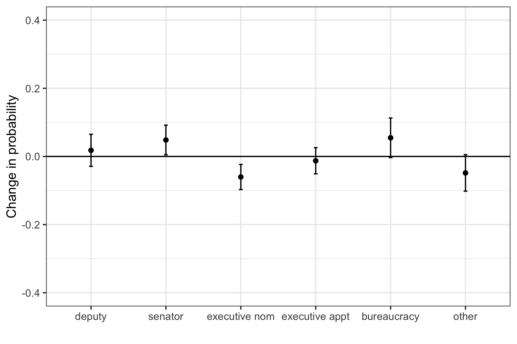
Based on this analysis, women have a significantly lower probability of being nominated for a future mayoral or gubernatorial position, which aligns with the author’s hypothesis.